Later Ctrl + ↑

Animating sports data in Tableau

Время чтения текста – 4 минуты

Previously we shared how to visualize your sports data from the SwingVision app in Tableau , using custom background and shapes. This time we are going to animate our dashboard to watch how landing locations of tennis shots changed over the match. Such an animation can be exported into a video file for later use. That’s what our result looked like in Tableau earlier:
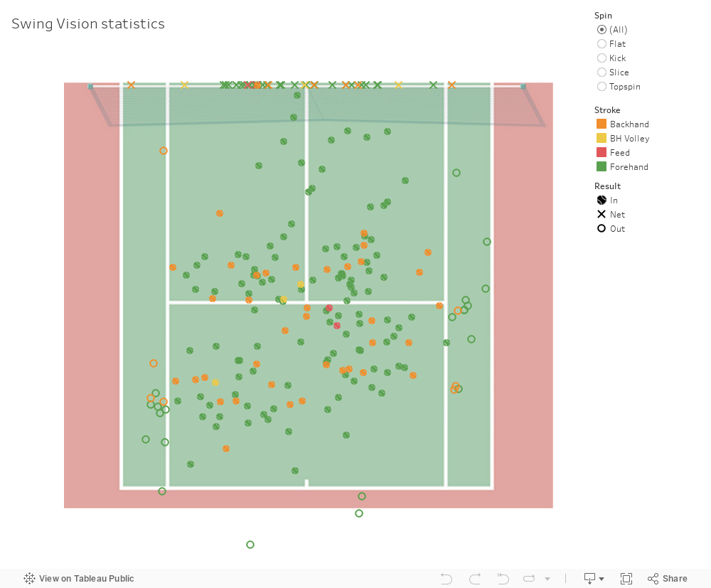
The chart shows landing coordinates of tennis shots on the court. Forehand shots are marked in red, backhands are in orange, the x marks for shots went into the net. We can also use filtering and get expanded tooltip info on hover.
Tableau enables us to create pages to flip through members of a field, changing and animating the analysis. In this case, all we need to is simply drag-and-drop the Shots table to the Pages shelf and click on the Play button.

Let’s switch to the dashboard and try adding the Pages shelf, just click on Worksheet -> Show cards and apply to the current page.

Next, create a new vertical container, drag the panel and minimize the view:

Now after clicking on the Play button, the first part is done:

If you’re a macOS user, it won’t be a problem to make a video from this animation by pressing ⌘ + Shift + 5 and choosing a specific part of your screen. In other cases, you may need to download third-party software for screen recording.

 No comments    581   2020   animation   BI-tools   dashboard   tableau

Custom visualization of sports data in Tableau

Время чтения текста – 8 минут

Being a tennis fan, I recently discovered a new app created to help players to assess their game skills – SwingVision. The app can recognize tennis shots in real-time and display its landing coordinates. The author of this app is Swupnil Sahai, currently he is a Lecturer at UC Berkley.

My tennis stats, shown by the app

SwingVision also allows you to view your “rallies” and specific shots, assess the average shot speed and error rate. Moreover one can easily export its stats as an Excel Table.

Example of exported table

In today’s material, we are going to create a custom Tableau chart that would reproduce stats from SwingVision and display the landing location of my shots on the court. First, we need to find a suitable tennis court image (top view), like this one.

Next, we need to import the data stored as an Excel Table into Tableau, set values for both coordinates using the Shot Placement (x), and Shot Placement (y) columns, and remove the aggregation of measures to get something like this:

After filtering shots by player the chart somewhat resembles the upside-down version of the actual image:

To reverse the image, we need to change the values of current x and y from positive to negative by creating new measures, add some color and everything will start to line up:

The X marks on the chart represent all shots that hit the net, we can hide them from view and set a constant value for Y =- 11,89, which corresponds to the length of a half-court.
Then when we try adding the background image, however, this will cause a warning, because the image is not scaled properly:

This means that we need to calculate the ratio of our image to the real-size court. In our case, for instance, the image is 913px in width, while the court itself is 10.97 meters wide, so by calculating 913 over 10.97, the ratio for x will be 83.227.

The middle of the court will be considered as the origin (0, 0), and will divide the court vertically into halves of 456.5px.
Remember that the image itself has margins, both to the right and left that are equal to 143.3px each. Just create new measures for x and y, substituting with the following values:

After these steps, our image should be as follows:

As finishing touches, we set a custom icon for each point on the chart and add filtering options.

To sum up, the dashboard displays everything we need: landing location of shots, their speed, types of strokes and expanded tooltip info on hover:

 No comments    898   2020   BI-tools   dashboard   tableau

Calculating User Retention by 24-hour windows and calendar days in SQL

Время чтения текста – 3 минуты

Yesterday I got a message from one of our blog readers, asking:

Let’s say today’s Monday, and an app was downloaded 187 times. If I want to find out what’s the Retention rate was on day 1, what day of the week should I start taking the count with?

He is referring to the blog post on Сalculating Retention Rate. I would like to clarify that since retention rate can be calculated by 24-hour windows, as well as by calendar days. In our case, day 0 will be Monday, and day 1 will be Tuesday. However, there is one little hiccup...

For example, if we started promoting our product on Monday, October 12 at 23:59, then all downloads of this day will have the retention rate of day 1. It’s a problem of performing calendar calculations. To address this, some data analysts calculate retention rate not only by calendar days but also by 24-hour windows.

Let’s apply this idea to the above case:

  • The Retention rate for day 0 can be calculated using the number of downloads from October 5, 23:59 to October 6, 23:59.
  • The Retention rate for day 1: from October 6, 23:59 to October 7, 23:59
  • And so on rolling 24-hour window.

How to calculate Retention Rate by 24-hour windows in SQL?

Let’s recall one of the queries from our previous post. It was written to calculate the difference between the download date and the user activity date. We need to change the query so that user activity is calculated by 24-hour windows. To accomplish this just change the calculation for datediff to 24-hour windows, updating the lines in bold.


SELECT from_unixtime(user.installed_at, "yyyy-MM-dd") AS reg_date,
   floor((cast(cs.created_at as int)-cast(installed_at as int))/(24*3600)) as date_diff,
   ndv(user.id) AS ret_base
   FROM USER
   LEFT JOIN client_session cs ON cs.user_id=user.id
   WHERE 1=1
     AND floor((cast(cs.created_at as int)-cast(installed_at as int))/(24*3600)) between 0 and 30
     AND from_unixtime(user.installed_at)>=date_add(now(), -60)
     AND from_unixtime(user.installed_at)<=date_add(now(), -31)
   GROUP BY 1,2

Updated query:

SELECT 
       cohort.date_diff AS day_difference,
       avg(reg.users) AS cohort_size,
       avg(cohort.ret_base) AS retention_base,
       avg(cohort.ret_base)/avg(reg.users)*100 AS retention_rate
FROM
  (SELECT from_unixtime(user.installed_at, "yyyy-MM-dd") AS reg_date,
          ndv(user.id) AS users
   FROM USER
   WHERE from_unixtime(user.installed_at)>=date_add(now(), -60)
     AND from_unixtime(user.installed_at)<=date_add(now(), -31)
   GROUP BY 1) reg
LEFT JOIN
  (SELECT from_unixtime(user.installed_at, "yyyy-MM-dd") AS reg_date,
    floor((cast(cs.created_at as int)-cast(installed_at as int))/(24*3600)) as date_diff,
          ndv(user.id) AS ret_base
   FROM USER
   LEFT JOIN client_session cs ON cs.user_id=user.id
    WHERE 1=1
     AND floor((cast(cs.created_at as int)-cast(installed_at as int))/(24*3600)) between 0 and 30
     AND from_unixtime(user.installed_at)>=date_add(now(), -60)
     AND from_unixtime(user.installed_at)<=date_add(now(), -31)
   GROUP BY 1,2
  ) cohort ON reg.reg_date=cohort.reg_date
    GROUP BY 1        
    ORDER BY 1

Final output:

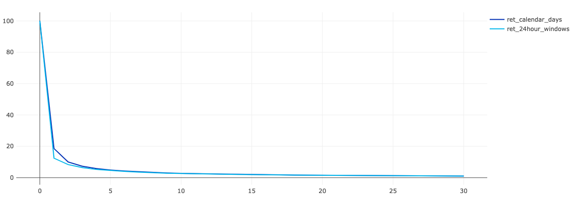
Compare it with the previous one:

And as you see, the retention rate calculated using 24-hour windows is slightly lower in the first days.

 No comments    1302   2020   Q&A   redash   retention

Defining a problem statement for Analytical Dashboard

Время чтения текста – 4 минуты

In our previous post, we announced the beginning of a new series about modern Business intelligence (BI) tools. As the adage goes, “problem first, solution second” – today we’ll start by defining our problem. Let’s consider a fairly common scenario for a large company, one that almost every company, where I happened to work encountered with. Suppose that a top management team holds monthly meetings to review the results of the past month. Their key goal is to maximize the company’s dividends and profits.
Hence the team needs a tool that would display the historical profit trend with some other key indicators for the reporting period. The tool is needed to understand where and how profit is formed, and what are the main drivers for profit growth. We suggest using an analytical dashboard as such a tool.

Problem Statement

Our goal is to design and create a Dashboard using the Superstore Sales data (which is really close to reality) to provide answers to the following questions:

  1. What are the performance indicators values for the past month? It’s necessary for stocktaking and comparing it against the same period last year.
  2. What key factors do affect profit growth?
  3. What categories, subcategories, products and clients generate more profits, and what ones that bring losses?

Reviewing Data

The data contains information about customer purchases (Orders list) and returns (Returns list). The purchasing data includes all available information on orders: record ids, order dates, order-processing priority, number of items, sales and profit margins, discounts, shipping options and prices, customer data, and other useful information. But are only interested in the Orders list.

Snippet of the Orders list

Designing a Layout

We’ll position the header with a brief description on top of the page. Then, goes the time-based filter on par with the header. And the subheading “KPI” on the next line.

First of all, we want to generalize key changes according to the factoids:

  • Profit and YoY growth
  • Sales and YoY growth
  • Orders count and YoY growth
  • Avg Discount and YoY growth
  • Number of customers and YoY growth
  • Sales per Customer and YoY growth

Below will be a graph presented as a tree-like map (or equivalent) with top regions by sales count. It will be comprised of different rectangles, the size will correspond to sales volume while the color to profits made. This brings more clarity and helps understand which regions are most effective. It would be great if the reviewed BI tool would provide expanded information upon clicking on a region so that we could see the difference between regions.

More to the right will be a graph with a historical profit trend, displaying how profits change over time. We will try to dot the reviewed month and the same month last year to trace a trend.

Next is products and customer segments. The horizontal bar chart on the left side will be displayed sales volume and profits arranged by categories and subcategories. And try adding a filter for top product names by profit if the BI tool functionality allows so.

Learn more about how to build an interactive waterfall chart

On the right is a horizontal bar chart with top products sorted by profit
volume.

On the bottom of the page, there will be a horizontal bar chart displaying most lucrative clients. It’s very similar to the previous one, but instead of product names will be shown names of customers grouped by their segment and amount of generated profits.

To sum it up, our dashboard layout will look something like this:

Dashboard draft layout
 No comments    721   2020   BI   BI-tools   dashboard

Guide to modern Business Intelligence Tools

Время чтения текста – 2 минуты

In our new series, we will try to give a detailed representation of  several BI tools using the SuperStore Sales dataset. The data in SuperStore Sales reflect sales and profit of the retail chain in US dollars.

In the upcoming blog post, we will discuss a real problem statement that could arise when creating a dashboard based on the SuperStore Sales data and design a functional layout to provide clear answers. Throughout this task, we’ll stick with a predefined set of colors to make the comparison more unbiased.

Next, we’re going to create a dashboard that would assist in data-based decision-making with each of the BI tools. We also plan to involve industry experts to learn from their experience.

A complete list of BI systems and tools to be tested in our experiment is provided below. I want to welcome everyone who is willing to help us in solving this challenge to message me on Telegram  – @valiotti. I will be glad to hear from you. Although it’s a non-profit project, it’ll be really useful for the open-source community.

We plan to cover the following list of tools:

Free Open Source:

  • Metabase
  • Redash
  • Apache Superset
  • Dash / Plotly

Free Cloud-Based:

  • Google Studio
  • Yandex Datalens

Paid Cloud-Based:

  • Mode
  • Cluvio
  • Holistic
  • Chartio
  • Periscope
  • DeltaDNA
  • Klipfolio
  • Count.co

Paid:

  • PowerBI
  • Tableau
  • Looker
  • Excel
  • Alteryx
  • Qlik Sense
  • Qlik View

The final goal is to evaluate the BI tools against the following criteria:

  • learning curve of BI tool (1 — too hard to learn, 10 — easy)
  • tool functionality (1 — very poor functionality, 10 — multifunctional)
  • ease of use (1 — very inconvenient, 10 — super convenient)
  • compliance of the result (1 — far from the designed layout, 10 — too close to the designed layout and objective)
  • visual evaluation (1 — poor appearance, 10 — great visual appearance)

An integral weighted score for each tool will be calculated based on the internal estimates.

The results will be posted to our Telegram channel @leftjoin_en and followers will also be able to share their thoughts on the experiment.
By the end, each tool will be represented as a point in the plane, which will be divided into 4 parts.

This article will be updated with links and ratings as we new posts come out.

 No comments    1042   2020   BI-tools   excel   looker   powerbi   redash   tableau
Earlier Ctrl + ↓